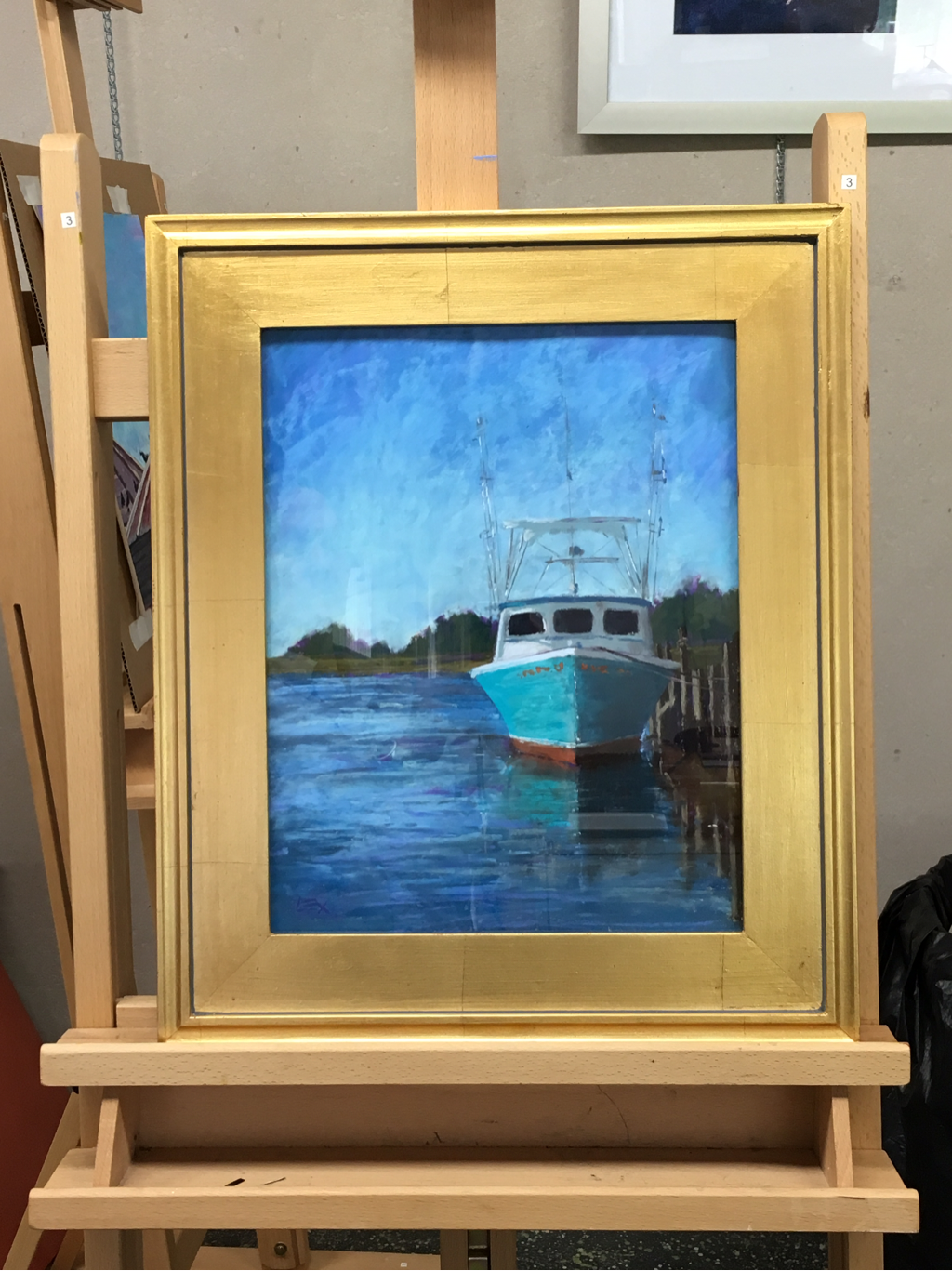
 The Miss Laura Louise is framed, packed and ready to travel to Cape Cod! Framing always takes me longer than I think it will; this year I have a Logan point driver, which is so much easier and faster than pushing points with a hand tool. Still, with a new baby, it's hard to find the stretch of time needed to work with glass and sharp things in the studio! The munchkin comes with me to the studio on some days, when I'm painting or working on the computer. I use non toxic spike lavender and walnut oils when oil painting, and I have an air filter near the easel when I paint with pastels, but some days are just not good for babies in the studio.
Anyway, fellow FPO artist Christine Chisholm has kindly offered to ferry my painting to Cape Cod next weekend, since I'll be away at my (20th!) college reunion. Thanks, Chris! For Pastels Only on Cape Cod opens June 14, with a reception June 18. For more info, check out the website of the Pastel Painters Society of Cape Cod. http://www.pastelpainterssocietyofcapecod.com/
0 Comments
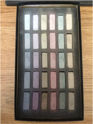 The luscious Maggie Price grays The luscious Maggie Price grays Oh boy, it's Christmas. I decided that I needed to expand my selection of pastels, and with back-to-school sales at most of the art supply stores, I hoped for a good deal. I shopped around pretty obsessively for almost two weeks, and finally took the plunge. An investment for the future, as they say. So now, in addition to my 30+ year old Yarkas, a surprisingly versatile Mungyo Gallery set, some Charvin and NuPastels for fine lines and blending and my Sennelier starter set, I now have Sennelier landscape colors and the lovely Terry Ludwig grays collection inspired by Maggie Price. All of which necessitated some new storage! I know some folks like to keep their precious pastels safely entombed in the little individual foam pockets they arrive in, but honestly, what a pain. If I keep all the pastels in their separate boxes on layers of foam, how will I choose colors? How can I compare a gray green from the Mungyo set to one from the Sennelier or Ludwig sets? And where will I put all those little foam trays? How will I even remember what I have, enough to go digging for the proper box? So, off I went to the interwebs to find a tray that could hold all the colors, with minimal compartmentalization--just enough for broad categories: reds, yellows, blues and grays. Ideally, I wanted something that I could use at home in my studio, but would also be portable when I decided to paint outside--without having to choose and repack everything each time. And I found some that were perfect...except for the price! Really, hundreds of dollars for wooden boxes of the right depth, without any padding to prevent breakage, and without any way to coordinate with my plein air setup. If I had the bucks to buy everything new, I would be home free--but I haven't been buying lottery tickets lately! I have an ancient Grumbacher pochade box given to me by a friend--sturdy and classic--and a really nice heavy duty tripod that I bought for my professional video camera when I was in grad school. That setup has served me well for oil painting, so I wanted to build a special tray insert so I could use it with the pastels. 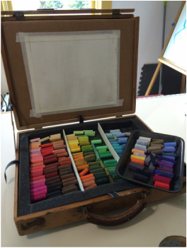 Long story short, I found a custom foam company online where I could order high density polyethylene foam sheets, cut to my specs for thickness and size! The foam arrived the other day, along with special glue, and after a little bit of work with an exacto knife I have a foam insert that fits snugly into the main compartment of the pochade box. I made dividers out of foam core, and I use a styrofoam butcher's tray to pull out a subset of my colors for each painting. There's a lid for the lower compartment to hold all the pastels in place when the box is closed.
I make my own substrates for pastel painting too, using Golden's Acrylic Pastel Ground over either cold press watercolor paper (the less expensive option) or Arches oil paper (my favorite paper, but a little pricier at $7/sheet). In this photo you can see a sheet of prepared paper taped with acid free masking tape to a cardboard support that fits in the slots in the pochade box lid. When I go outside to paint, I'll bring sheets of glassine, tape, more cardboard and butterfly clips to make a 'painting sandwich' that will protect my work while I carry it home. Phew! I'm sure there are some kinks to work out, but I'm excited to give it a try! 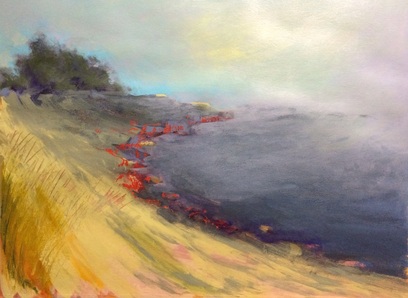
Well, this is better, right? Sometimes bigger is better. This acrylic painting on paper is 22" x 30"-- a full sheet. Thanks to Mr. Ryder's video advice, I kept at the versions of the painting until my brain could get out of its own way and think more about the form and the brushstrokes than the details. I also love the bright red that draws the eye up the coastline and balances the softer grays of the fog--this was achieved using Mr. Ryder's trick of laying down a layer of oil bar pigment and painting over it with acrylic. Then, since acrylic won't really stick to oil, you can come back in with a palette knife and scrape away the top layer to let the depth of the rich oil color come through. I did this also with the grassy area on the far left. Loads of fun, and well worth the effort of repeated studies! I'll definitely keep working on this technique!
I decided to try some abstract landscapes this week, inspired by a fabulous video series by UK painter Brian Ryder, available at the North Light Shop. What a terrific pair of videos! Usually when you see an instructional video with an artist doing a demo, there's a rehearsed feel to the art, and you get the sense that the artist is showing you a repeat of a painting he/she has done before--all the kinks are worked out, all the decisions made, everything tried and true. But Mr. Ryder simply lets us watch while he paints, narrating his process and his choices and showing us how he gets from initial studies in watercolor and oil to a large scale abstract landscape in acrylic. He lets us see him consider his options and work through the painting in a completely fresh first pass. The only thing practiced is his technique, which has obviously been honed through years of painting. This has to be one of my favorite resources from a great artist! (The other being a stellar video from Marshall Arisman, I'll link to that in a separate post!) So, starry-eyed and excited, I decided to try an abstract version of a recent pastel landscape study...and I have to say it's really not ready for prime time! But in the interest of hopefully showing improvement and steadily gaining a new skill, I'll show you what it looked like: On the left is the full study, 12" x 12" (Not sure why it appears rectangular here; the painting is square, so I guess Weebly has some format restraints on the gallery images). There are some things I like about it: the sky and fog, the sense of motion of the water hitting the shore line, and some of the foreground brush strokes. But the composition is awkward and the color scheme is not right (this is acrylic, by the way, though the first study was pastel). The setting was supposed to be Blueberry Hill in Acadia National Park, and the reference photos I took were on a foggy cool day...my abstract somehow looks to me like Barbados before a storm. ;-/ The pic on the right is a cropped version, which I think somewhat improves the composition. What do you think? Anyway, clearly I have to practice this abstract stuff...poor me.
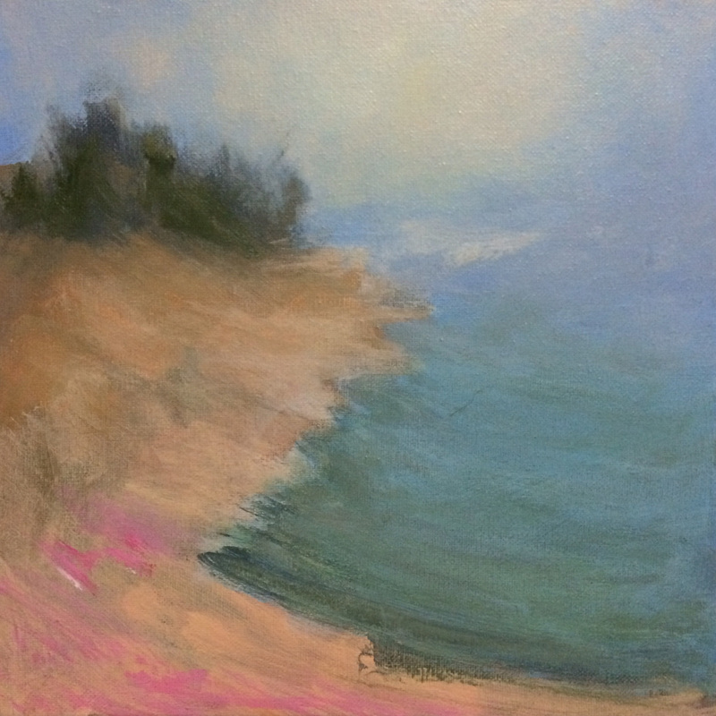
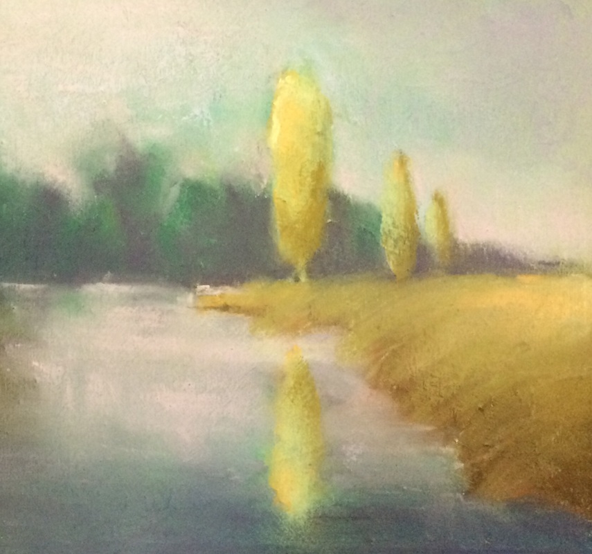
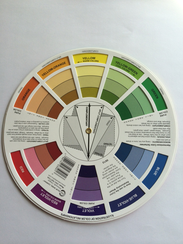
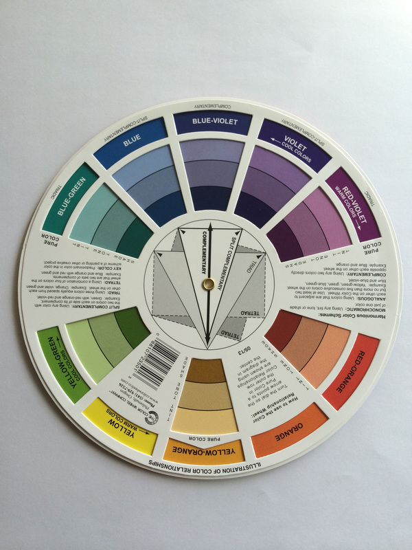
I recently came across an older series of posts from James Gurney about relative neutral grays and using gamut masking to tailor your color choices with a limited palette. http://gurneyjourney.blogspot.com/2011/09/part-1-gamut-masking-method.html I decided to give it a try, and used my pocket color wheel to choose limited palettes for two small pastel studies. For the first, a harmonious range of yellow-orange, yellow, yellow-green and green, plus just a bit of complementary violet and pink (red tint); for the second, a range of blue-green through red-violet with a pretty strong complementary yellow-orange. (Yes, OK, those are pretty big ranges for a limited palette, but I'm a color nut and find it VERY hard to limit my colors in pastels!) |
Alexia Rosoff Wilber
News and notes about art. Archives
July 2020
Categories
All
|

 RSS Feed
